CSS
This section explains the CSS elements of the framework. The most important layout components are containers and the grid system. Tables and some classes for color selection are also explained.
This section explains the CSS elements of the framework. The most important layout components are containers and the grid system. Tables and some classes for color selection are also explained.
Create complex layouts using a 12 column grid system. A web page can be thought of as a kind of table with several columns and rows. For example, if the table is 12 columns wide and 1 line high, more than 450,000,000,000 positioning options are possible. By implementing further classes, there are even more options available.
Containers enclose several DOM elements and define their maximum width. Ideally, the container classes should be included in semantic elements, for example <main></main> or <section> </section> tag.
| Sehr Klein | Klein | Mittel | Groß | Sehr Groß | Elastisch | |
|---|---|---|---|---|---|---|
| Breite | 60% | 80% | 90% | 95% | 100% | 100% |
| Klassenname | .container-xs | .container-s | .container-m | .container-l | .container-xl | .container-elastic |
<div class="container-xs">.container-xs</div>
<div class="container-s">.container-s</div>
<div class="container-m">.container-m</div>
<div class="container-l">.container-l</div>
<div class="container-xl">.container-xl</div>
Once the container sizes have been determined, a .row class is created. Each <div> tag with the class .row represents one line in our mental table. Up to 12 .col classes can be included within the Row. They divide the free space among themselves.
<div class="row">
    <div class="col">Erste von zwei Spalten</div>
    <div class="col">Zweite von zwei Spalten</div>
</div>
<div class="row center">
    <div class="col">Erste von drei Spalten</div>
    <div class="col">Zweite von drei Spalten</div>
    <div class="col">Dritte von drei Spalten</div>
</div>
Alternatively, individual or all elements can be provided with a certain size. Depending on the prefix, different screen sizes are addressed. If you want elements to be the same size on all screen sizes, it is sufficient to define .xs.
| extra small (< 400px) | small (< 600px) | medium (< 950px) | large (< 1240px) | extra large (> 1240px) | |
|---|---|---|---|---|---|
| Class name | .xs | .s | .m | .l | .xl |
| Colum number | 12 (Konfigurierbar) | ||||
| Nesting | Ja | ||||
| Column ordering | Ja | ||||
<div class="row">
    <div class="col">1 von 3</div>
    <div class="col xs6">.xs6 (wider)</div>
    <div class="col">3 von 3</div>
</div>
<div class="row">
    <div class="col">1 von 3</div>
    <div class="col xs9">.xs9 (wider)</div>
    <div class="col">3 von 3</div>
</div>
<div class="row">
    <div class="col xs7">.col .xs7</div>
    <div class="col">2 von 3</div>
    <div class="col">3 von 3</div>
</div>
It is also possible to nest several tables into each other - this creates even more possibilities to design a layout. All the above-mentioned attributes are still applicable.
<div class="row">
    <div class="col">Level 1 .col</div>
    <div class="col">Level 1 .col
        <div class="row">
            <div class="col">Level 2 .col
                <div class="row">
                    <div class="col">Level 3 .col</div>
                    <div class="col">Level 3 .col</div>
                </div>
            </div>
            <div class="col">Level 2 .col</div>
        </div>
    </div>
    <div class="col">Level 1 .col</div>
</div>
If the specified columns in a table do not fill the maximum width of the screen, they can be positioned as desired. By default, elements and texts are centered right-justified.
<div class="row start">
    <div class="col"> .row in .container-m | .start</div>
</div>
<div class="row center">
    <div class="col xs3"> .row in .container-m | .center</div>
</div>
<div class="row end">
    <div class="col"> .row in .container-m | .end</div>
</div>
In case a container is higher than the enclosed elements, the child elements can be positioned either above, below or in the middle.
<div class="row top">
	<div class="col blue-medium"> .row in .container-m | .top</div>
</div>
<div class="row row-cust-height middle">
	<div class="col blue-medium"> .row in .container-m | .middle</div>
</div>
<div class="row row-cust-height bottom">
	<div class="col blue-medium"> .row in .container-m | .bottom</div>
</div>
Afterwards it is still possible to change the position of some elements. For example, the columns can be arranged or indented.
To avoid having to define empty columns, individual elements can be pressed further to the right. The logic is similar to that of the grid system and therefore easy to link.
<div class="row">
    <div class="col push-xs2"> .col .push-xs2</div>
</div>
<div class="row">
    <div class="col push-xs4"> .col .push-xs4</div>
</div>
<div class="row">
    <div class="col push-xs6"> .col .push-xs6</div>
</div>
<div class="row">
    <div class="col push-xs8"> .col .push-xs8</div>
</div>
<div class="row">
    <div class="col push-xs10"> .col .push-xs10</div>
</div>
<div class="row">
    <div class="col push-xs11"> .col .push-xs11</div>
</div>
For example, if we have now defined 6 column elements and want to bring the last one to the very front of the source code, we can use the class first. To achieve the opposite, we use the class last. Furthermore, the complete order can be changed via the classes order1 - order12.
<div class="row center">
    <div class="col"> DOM Element 1 </div>
    <div class="col"> DOM Element 2 </div>
    <div class="col first"> DOM Element 3 | .first</div>
</div>
If you have previous knowledge of precompiler and in particular of the languages SASS and SCSS, you can change the values of predefined variables and personalize the stylesheet. For example, the number of columns can be changed from 12 to 24.
You can also change the breakpoints or the margin.
| Varibale name | Values | |
|---|---|---|
| Columns Grid | $anzColumn | Number (0-24 recommended) |
| Grid Breakpoints | $small-min | Number (0-∞) |
| Grid Breakpoints | $medium-min | Number (0-∞) |
| Grid Breakpoints | $large-min | Number (0-∞) |
| Grid Breakpoints | $xxlarge-min | Number (0-∞) |
| Automatic Margine | $margin-auto | Percent (0-100) |
The framework offers a small selection of predefined color spaces. In addition to the basic colours, we also offer an extended colour space and predefined themes, such as one for autumn colours.
<div class="orange-medium"></div>
<p class="text-orange-medium"></p>
Here all color wheel colors are prepared with 12 different tans as class names.
Der erweiterte Farbraum fügt weitere wichtige Farben zur Farbauswahl hinzu.
The expanded color space adds more important colors to the color selection.
Do you want to open a web shop for autumn fashion, but you have no previous knowledge of colour theory? Even this should not be a problem for them with the predefined schemes.
Since media elements are often built into web pages, we have provided some classes that make it easier to integrate. We have divided the media into pictures, videos and audio.
To make images through the framework responsive there is the class .img-wrapper which allows images to be automatically adjusted to the size of the browser window. In order to give images a special look, the classes .round-img and .circle-img can be used additionally to round off images or make it completely round.

<div class="image-wrapper">
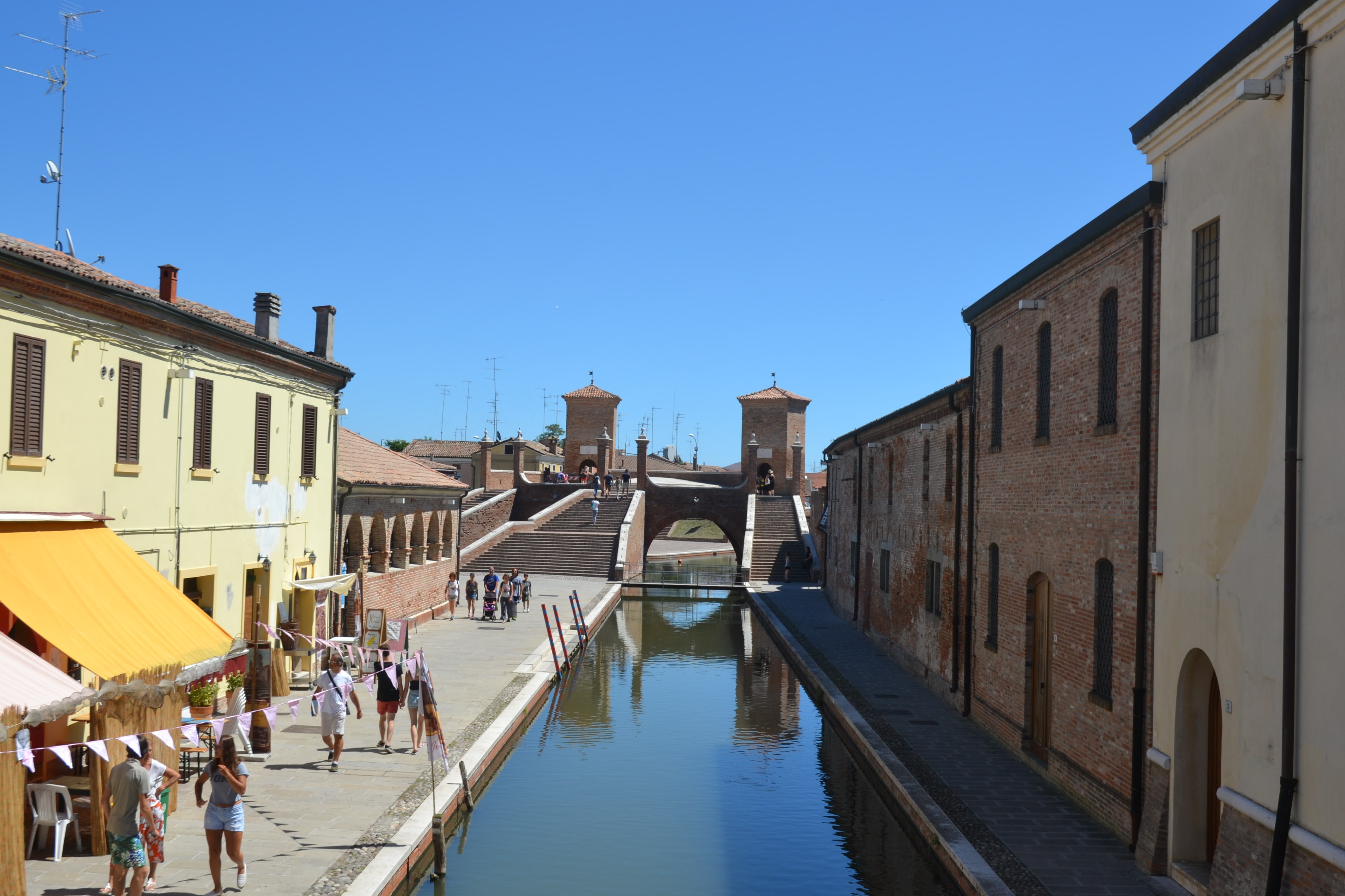
<img class="round-img" src="../../lib/img/expimage/CommachioI_HAG.jpg" alt="CommachioI Hagn">
</div>
<div class="image-wrapper">
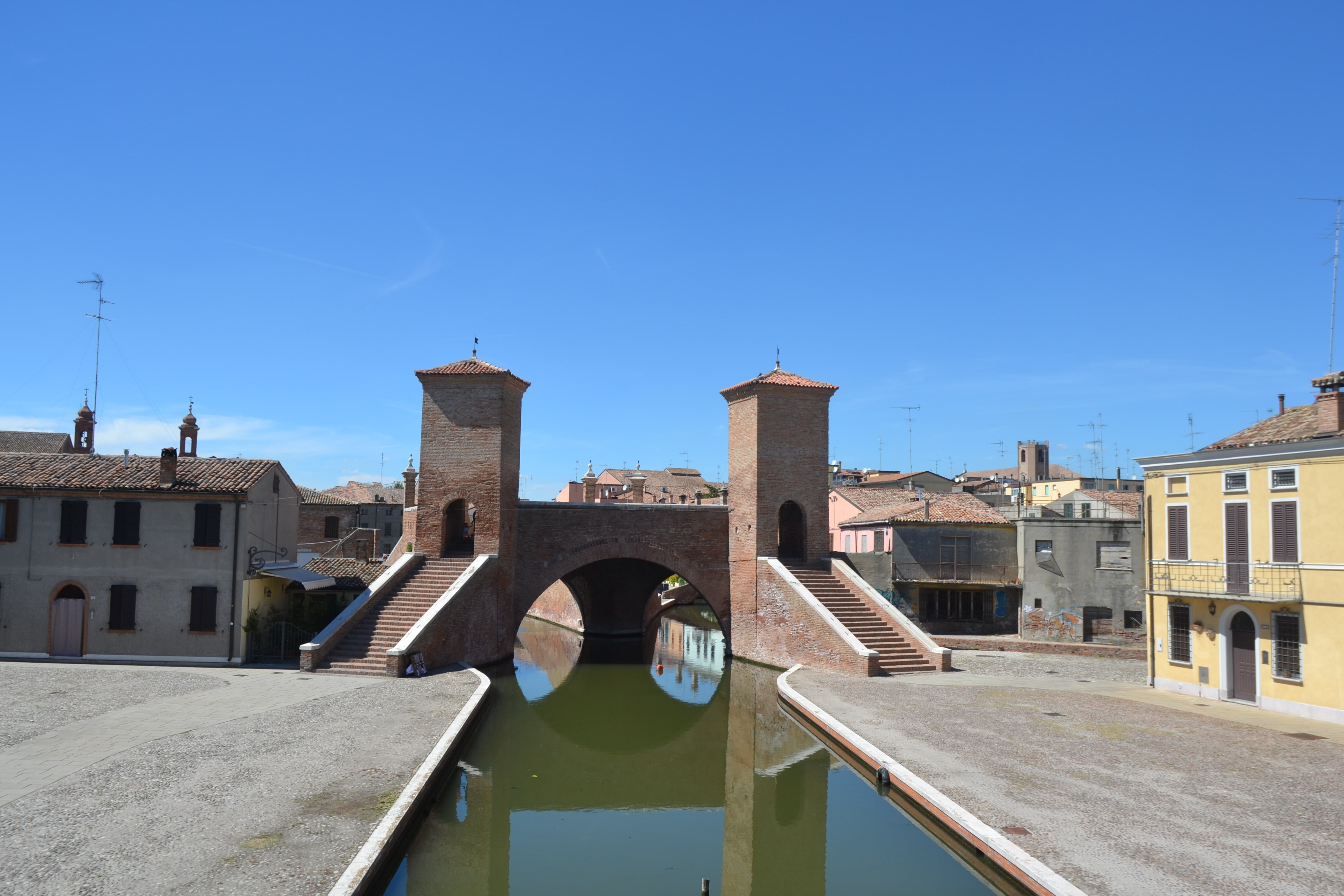
<img class="circle-img" src="../../lib/img/expimage/CommachioII_HAG.jpg" alt="CommachioII Hagn">
</div>
<div class="image-wrapper">
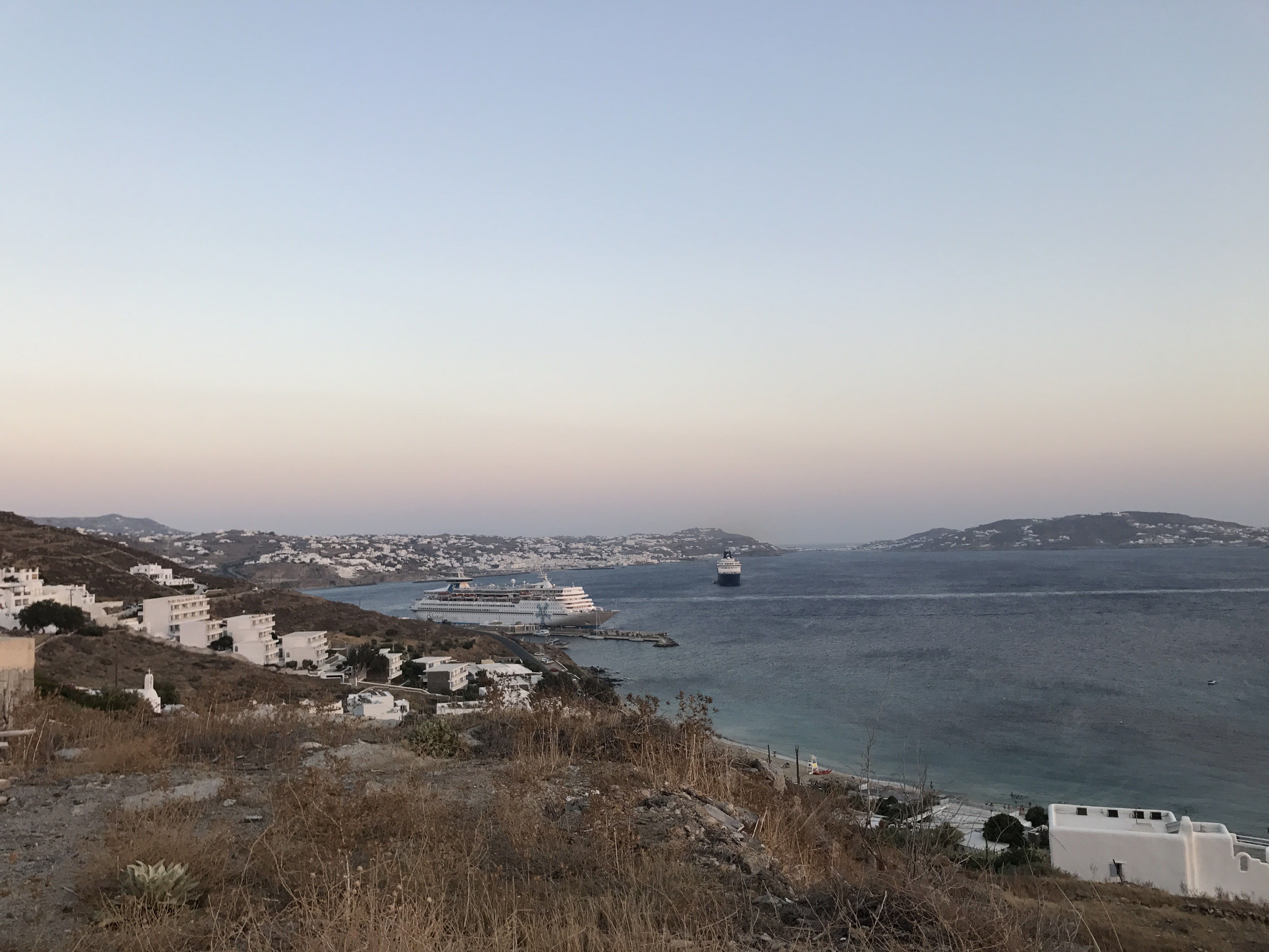
<img src="../../lib/img/expimage/CommachioIII_HAG.jpg" alt="CommachioIII Hagn">
</div>
The .video-wrapper-16 and .video-wrapper-4 classes allow videos to change in percentage of the browser window, one class being suitable for 16:9 videos and the other for videos in 4:3 format.
<div class="video-wrapper-4">
    <video controls class="col xs12">
        <source src="../../lib/img/expimage/Attersee%20I%20HAG.m4v" type="video/mp4">
    </video>
</div>
<div class="video-wrapper-16">
   <video controls class="col xs12">
       <source src="../../lib/img/expimage/Attersee%20I%20HAG.m4v" type="video/mp4">
   </video>
</div>
The <audio> tag in HTML offers a standard way to embed audio files in web pages. The default design of the tag is different in each browser. The framework contains the class .audio-wrapper which gives the audio tag an individual look and feel, which is the same in all browsers.
<h3 class="test">Gleiche Spaltengröße</h3>
Tables are another important layout element and can be used in many ways. The framework provides a standard design for the <table> tag. Additionally, there are 3 different classes which can be assigned to the <table> tag to give the table a special appearance. With the class .table-light, the background color of this table becomes gray when a line is passed over. The .table-responsive class gives the table the property to adjust itself to the browser window as a percentage. To use a striped table, the .table-stripped class must be added to the <table> tag.
| Farben | Schriftarten | Elemente |
|---|---|---|
| Rot | Roboto | Header |
| Grün | Raleway | Cards |
| Blau | Open-Sans | Footer |
| Farben | Schriftarten | Elemente |
|---|---|---|
| Rot | Roboto | Header |
| Grün | Raleway | Cards |
| Blau | Open-Sans | Footer |
| Farben | Schriftarten | Elemente |
|---|---|---|
| Rot | Roboto | Header |
| Grün | Raleway | Cards |
| Blau | Open-Sans | Footer |
                    <table>
    <tr>
        <th>Farben</th>
        <th>Schriftarten</th>
        <th>Elemente</th>
    </tr>
    <tr>
        <td>Rot</td>
        <td>Roboto</td>
        <td>Header</td>
    </tr>
    <tr>
        <td>Grün</td>
        <td>Raleway</td>
        <td>Cards</td>
    </tr>
    <tr>
        <td>Blau</td>
        <td>Open-Sans</td>
        <td>Footer</td>
    </tr>
</table>
<table class="table-light">
    <tr>
        <th>Farben</th>
        <th>Schriftarten</th>
        <th>Elemente</th>
    </tr>
    <tr>
        <td>Rot</td>
        <td>Roboto</td>
        <td>Header</td>
    </tr>
    <tr>
        <td>Grün</td>
        <td>Raleway</td>
        <td>Cards</td>
    </tr>
    <tr>
        <td>Blau</td>
        <td>Open-Sans</td>
        <td>Footer</td>
    </tr>
</table>
<table class="table-stripped">
    <tr>
        <th>Farben</th>
        <th>Schriftarten</th>
        <th>Elemente</th>
    </tr>
    <tr>
        <td>Rot</td>
        <td>Roboto</td>
        <td>Header</td>
    </tr>
    <tr>
        <td>Grün</td>
        <td>Raleway</td>
        <td>Cards</td>
    </tr>
    <tr>
        <td>Blau</td>
        <td>Open-Sans</td>
        <td>Footer</td>
    </tr>
</table>
This section deals with small tools that can be used to refine the layout of a website. To change the flow of an element there are the classes .float-right and .float-left. Another important class is .block with which elements can be defined as block elements, i. e. a line break occurs after this element. To separate contents, there is the class .line with which a separator can be added, it should only be used within the <hr> tag.
 Dieser Text ist rechts fließend
Das ist ein Block Element
                <span>Dieser Text ist links fließend</span>
<img src="../../lib/img/expimage/MykonosII_KUT.JPG" class="float-right" alt="MykonosII Kutis">
<span>Dieser Text ist rechts fließend</span>
<img src="../../lib/img/expimage/MykonosII_KUT.JPG" class="float-left" alt="MykonosII Kutis">
<span class="block">Das ist ein Block Element</span>
Since our framework contains elements like header, footer and cards, it also offers different box shadows for each element. The Shadow box has the effect that it makes elements look like the corresponding component is not part of the website, but on top of it. There are 5 different classes which cast a shadow of different intensity. The classes can be named .shadow-ex-light,.shadow-light,.shadow-medium, .shadow-hard and .shadow-ex-hard, whereby the shadow becomes stronger in ascending order.
<div class="shadow-ex-light"></div>
<div class="shadow-light"></div>
<div class="shadow-medium"></div>
<div class="shadow-hard"></div>
<div class="shadow-ex-hard"></div>
This section explains the .show and .hide classes. The framework contains some classes that determine which element is to be displayed and which element is to be hidden. Therefore there are the classes show-size and hide-size. The desired screen size should be used instead of the size. There are .sl, .md, .md-up.md-down,.lg and only .show without size. The same rules apply to .hide class.
                <div class="hide">Box hide</div>
<div class="hide-sl">Box hide-sl</div>
<div class="hide-md">Box hide-md</div>
<div class="hide-md-down">Box hide-md-down</div>
<div class="hide-md-up">Box hide-md-up</div>
<div class="hide-lg">Box hide-lg</div>
<div class="show">Box show</div>
<div class="show-sl">Box show-sl</div>
<div class="show-md">Box show-md</div>
<div class="show-md-down">Box show-md-down</div>
<div class="show-md-up">Box show-md-up</div>
<div class="show-lg">Box show-lg</div>
Parallax scrolling is one of the major new web design trends. This effect consists of individual layers that move at different speeds, giving the viewer the impression of depth. The parallax scrolling can be easily implemented in the framework and the class .parallax. The .parallax class should be applied to the <body> or a .container.
<div class="container-xl parallax" style="background-image: url('../../lib/img/expimage/MykonosIII_KUT.jpg')">
    Website Content
</div>
Animations show the user that an action has taken place. It doesn't always make sense to use them and "keep it simple"also applies here. An animation can also give the user some kind of feedback, e. g. explanatory texts may appear if the input is incorrect. A further example would be information boxes or announcements on initial registration. For some of these cases, classes with either the transition or animation attribute are provided. Furthermore, various keyframes were programmed out. These determine the type of animation, for example, an element can be moved out in all directions.
/* Dauer | Timingfunktion | Verzögerung | #Iterationen | Richtung | Füllmodus | Abspielstatus | Name */
animation: 3s ease-in 1s 2 reverse both paused slidein;
/* Variables Attribut | Dauer | Timingfunktion | Verzögerung */
transition: margin-right 4s ease-in-out 1s;
As mentioned above, animations use keyframes. In these, the position of an element can be determined within a certain time period of the animation. In the example below, a keyframe is defined using CSS - but if you download our framework, you don't have to pay attention to it. Simply use the provided class names in the following area.
@keyframes moveOut {
    from {top: 500px;}
    to {top: .200px;}
}
The classes listed below call animations when you create the Document Object Model. With advanced knowledge the classes can also be called at other times via JavaScript.
<div class="moveIn"></div>
<div class="moveOut"></div>
<div class="slideIn"></div>
<div class="slideOut"></div>
<div class="slideLeft"></div>
<div class="slideRight"></div>
<div class="Wiggle"></div>